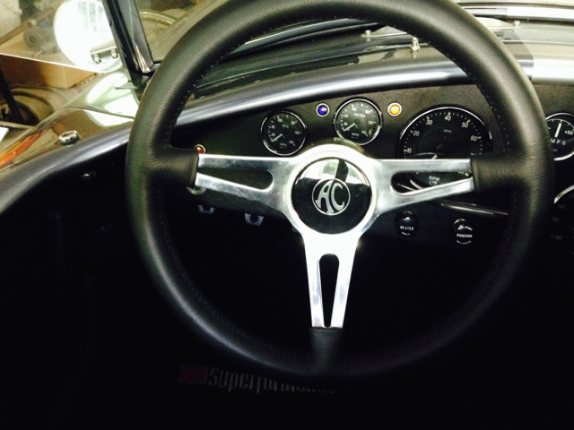
I went back and forth a few times. I like the appearance of both. The black and silver of the AC logo is both stark and appealing. In the end I fell down on the AC logo side of the street as the way for me to go. Here is what it looks like;

Ed
Follow on thought should have mentioned I got this from Finishline